Next client cohort starting JANUARY 5, 2026 -
apply today
Postdigitalist
Get started
The program
Work
Services
Work & Victories
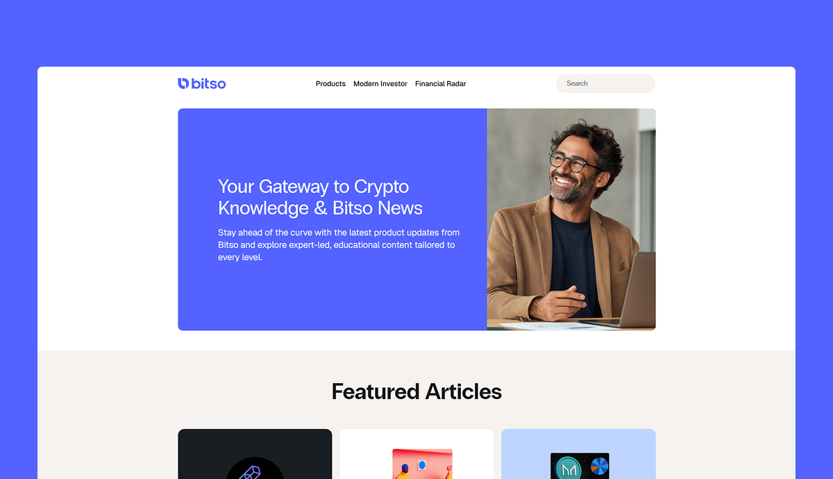
Crypto SEO case study: +234% traffic boost and +2K conversions without publishing a single blog post
In 2025, we relaunched Bitso's blog, boosting the commercial impact of a previously underutilized marketing asset. We collaborated with the content team & creative studio across content strategy, SEO and UX, to release a high-performing and on-brand blog MVP in time for Bitso's brand relaunch.
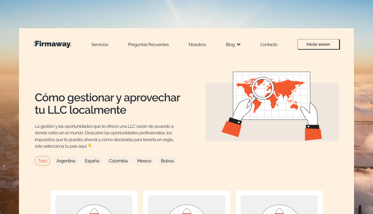
B2B SEO case study: How we turned a blog into Firmaway's top customer acquisition channel
Firmaway is a leader in providing LLC formation and tax compliance services to LATAM-based founders. From 2023 to 2025, we operated as Firmaway's core SEO + content team. During our partnership, we built their blog from scratch. We strategized, produced and distributed highly technical content that delivered consistent, measurable growth.
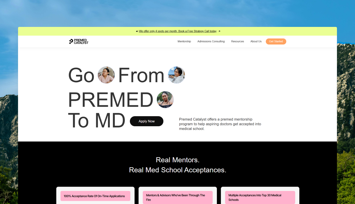
Education SEO case study: +255% organic leads in 3 months
In early 2025, we helped an up-and-coming education services startup validate SEO as a lead acquisition channel. The results were so solid that they inspired the creation of an in-house SEO task force.
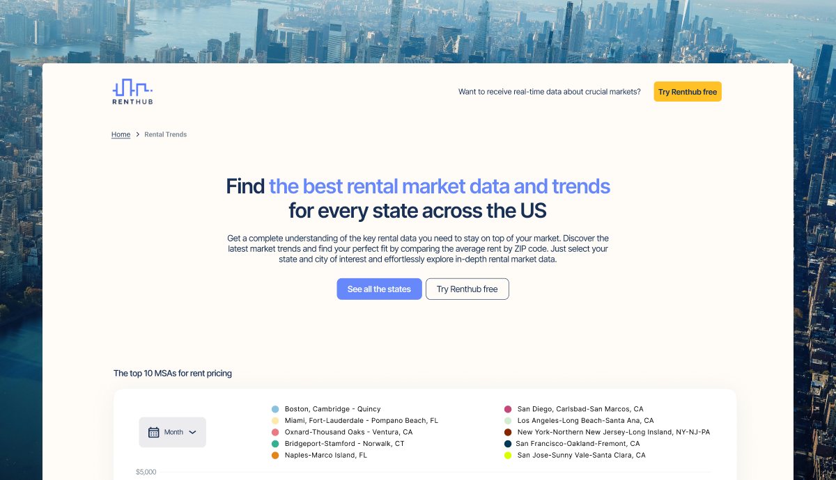
Real estate SEO case study: Reducing programmatic SEO costs by 96%
In 2024, we connected with Renthub, a platform providing real-time real estate data. In a partnership that included SEO strategy, copywriting, web design and web development, we helped Renthub relaunch its programmatic SEO collection on Webflow. This resulted in an instant traffic increase of 20% and a reduction in recurrent costs of over 96%.
Crypto email marketing & video SEO case study: Monetizing 400+ users with a single campaign
In mid-2024, one of Latin America's leading cryptocurrency platforms partnered with us to revitalize their dormant email marketing program. Through 6 newsletters + complementary YouTube videos, we engaged thousands of users, inspiring over 400+ to make their first deposit.
Let's build a Marketing OS that brings revenue,
not headaches
Book a 30-minute diagnostic call